-
Bug
-
Resolution: Fixed
-
None
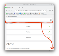
Website content is slightly wider than the brower's viewport when in narrow mode, i.e. less than 980px wide. It turns on horizontal scroll for a few pixels, which is a frustrating user experience.
In the dev tools I found the following media queries:
@media (max-width: 980px)
@media (max-width: 1120px)
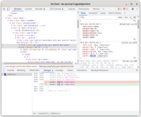
It looks like the search bar is the one to blame, as hiding with with display: none fixes the page width. Specifically, this element:
#main_title_bar > .search_bar > #___gcse_0 > .gsc-control-searchbox-only .gsc-control-searchbox-only-en > form.gsc-search-box.gsc-search-box-tools
For some reason this CSS rule is applied to it:
online.css:1374
form.gsc-search-box {
    width: 102.5% !important;
}


