Description
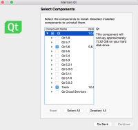
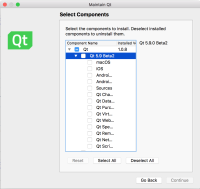
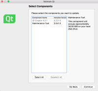
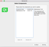
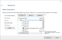
Maintenance tool's window is too narrow. Components' names under a version are further indented to the right so that their names are barely recognizable. As can be seen in the attached screenshots, there isn't a scroll bar neither. The only way to enlarge the window is to aim for a few pixels at the border of the screen which is very uncomfortable considering the alternatives.
It is surprising that this tool remained this way for so long. Please update the default window size and/or add a horizontal scroll bar, better yet redesign the UI.

