-
Bug
-
Resolution: Unresolved
-
P4: Low
-
None
-
Qt Creator 8.0.2, Qt Creator 9.0.1
-
None
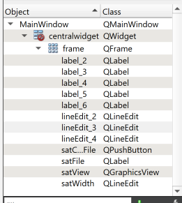
The color choice for the current selection when the object editor doesn't have focus is extremely unfortunate given the color choice for dark rows.
Some other color with more contrast should be used when the object inspector is not active (which it never is while clicking widgets). Blue would be reasonable.
I will leave determination of exactly which widget is currently selected as an exercise to the reader:

I don't recall this being an issue with older versions of Creator; unless I'm mistaken (I might be) the odd/even row coloring hasn't always been there, and so the light gray was always visible when the rows were always white.