-
Epic
-
Resolution: Unresolved
-
 Not Evaluated
-
None
-
None
-
Categorised example view
-
4d71a24cb (master), e060f82fa (master), a2de016f6 (master)
Why
Current example view in welcome screen lists all the examples in one grid. It's ordered so that highlighted examples are first and then the rest in alphabetical order.
Examples are tagged but since there are so many examples the list becomes long and it's hard to find meaningful examples.
What
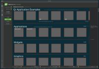
Qt doc has categorised examples per module and similar grouping should be done for Qt Creator example view. Categorisation should follow same logic as in the Qt documentation. Categories and examples should come directly from documentation xml file and nothing but the view is implemented in Qt Creator.
See
https://doc.qt.io/qt-6/qtexamples.html
https://doc.qt.io/qt-6/qtexamplesandtutorials.html
In addition to listing examples per category there should be "Highlighted" panel at the top which shows ~10 handpicked examples, either from Qt or Qt Design Studio. Highlighted panel could be 2 rows in height contrarily to other groups which are just one row. In wireframe it's just one row but once creating proper spec, 2 rows should be evaluated.
After categorisation is done, example tags are not needed anymore to be visible in the example grid items.
See attached wireframe.
