Details
-
Suggestion
-
Resolution: Unresolved
-
 Not Evaluated
-
None
-
5.12.3
Description
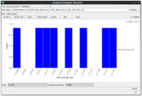
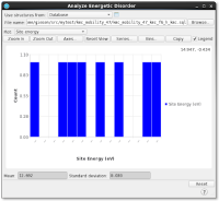
There are challenges with assigning font size and customization to axis labels. In particular, for histogram X-axis, if the labels aren’t the right size the label is shown as “...” - so the entire axis has no meaningful labels.
Preferably, we would like to directly set font size of the labels and ideally be able to set the '...' values when the chart is too compressed.
It is a general problem. QChart axis labels are replaced with ellipses when there is not enough room to show them. There should be either API to indicate that axis labels are truncated due to limited space or it should have an API providing ideal size of chart window to ensure that axis labels are properly visible, or it should have an option to auto expand chart when labels are not fully visible.


