-
Suggestion
-
Resolution: Done
-
P3: Somewhat important
-
5.6.0 Beta
-
None
-
135b5cdecaeaecb1f3afe01103eac5970399efa7
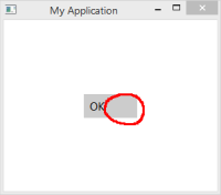
I think it would be nicer if the horizontal alignment of the text of a button would be Text.AlignHCenter (like in Material style for example) instead of Text.AlignLeft.
