-
Change Request
-
Resolution: Out of scope
-
 Not Evaluated
-
None
-
None
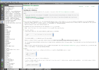
As can be seen in the attached screenshot, the blocks of preformatted text look wrong when the documentation is viewed in Qt Creator (tested with 2.0.0).
- The boxes around the preformatted text should not have a scrollbar.
- The boxes should be wide enough for the text. Right now the text is wrapping.
- The font of the monospaced text is ugly, looks like Courier while Linux has better looking monospace fonts (usually "monospace" font category works fine, if it does not here then maybe that should be fixed in Qt Webkit).
