-
Bug
-
Resolution: Fixed
-
P1: Critical
-
Development Snapshot 0.2.2
-
4a72a2b8ec099ccb37aa5a105cbdc85f23e2291c
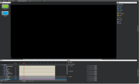
See the attached screenshot, the macOS look'n'feel differs from the intended (the one we have on Windows). Here are at least some observations:
- Dockable panel titlebar has light gray color making it impossible to read the text of the titlebar.
- Dockable panel titlebar icons look wrong.
- There is wasted space (looks like status bar area) at the bottom of the app window.
