-
Bug
-
Resolution: Unresolved
-
 Not Evaluated
-
None
-
QDS 3.8
-
None
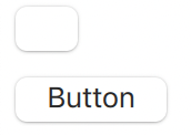
When you pull a std button from component library it looks like this:

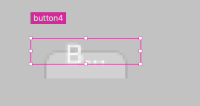
Ok, it's cropped from the bottom and text is not aligned. When you resize it, you get

Again, text is not aligned.
100% repro by changing style to macOS and dragging a button element to the 2D view.
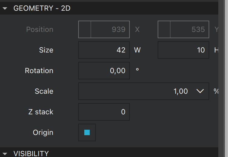
By looking at the properties view, we can see that when the macOS style is applied, it changes width and height properties:

- is required for
-
QDS-8545 Buttons in default style do not have the correct implicit size in the form editor
-
- Open
-


